Build an AI-Powered Glacier Monitoring System: What Satellites Revealed Before the 2026 Langtang Lirung Collapse
- The Problem: How Do You Monitor a Mountain from Space?
- Four Different Views of the Glacier
- The Architecture
- Step 1: Build a Historical Baseline
- Step 2: Something Really Was Unusual
- Step 3: Look Beyond the Event
- Step 4: Ask AI to Find Unusual Environmental States
- Understanding Anomaly Detection
- Step 5: Satellite Data Has to Pass a Quality Test
- What This Project Really Teaches About AI
- Try It Yourself
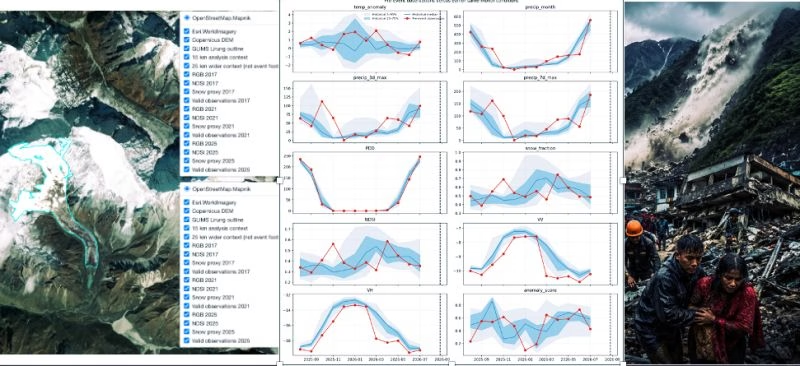
On 26 August 2026, a glacier–rock slope failure occurred at Langtang Lirung in Nepal causing widespread destruction to life and property.
Imagine you had been monitoring the mountain before it happened.
Could satellites have seen anything unusual?
Could decades of climate data reveal warning signs?
And perhaps the most interesting question for an AI student:
Could machine learning detect that something unusual was happening?
These questions sound like the beginning of an AI prediction system. But this project produced a more interesting—and scientifically useful—lesson.
The data showed exceptionally warm, melt-favourable conditions before the event. Yet the AI anomaly detector did not identify a unique monthly warning signal.
That apparent contradiction teaches us something important about real-world AI:
Detecting something unusual is not the same as predicting what will happen next.
This tutorial explores how satellite observations, climate data, statistics, and unsupervised machine learning were combined to investigate the environmental conditions surrounding the Langtang Lirung event. It focuses on the ideas and workflow rather than implementation details.
What You’ll Learn
By the end, you’ll understand:
- ✔ How satellites can help us monitor glaciers
- ✔ Why multiple sensors are better than relying on one dataset
- ✔ What unsupervised anomaly detection means
- ✔ How historical climate data provides context for an event
- ✔ Why data quality matters as much as the AI model
- ✔ Why an AI anomaly score is not a probability of disaster
- ✔ Why negative AI results can still be scientifically valuable
Research PDF and Code Repo
A formal research-style PDF version of this article is available here:
GitHub Code Repo can be accessed here : https://github.com/debabratapruseth/ Langtang-Glacier-AI-Multisensor-Analysis-of-the-2026-Langtang-Lirung-Event/releases/ tag/v2.0.0-arxiv
Suggested citation:
Pruseth, D. (2026). Multisensor Earth Observation and Unsupervised Anomaly Analysis of Environmental Conditions Preceding the 2026 Langtang Lirung Glacier Collapse and Slope Failure. Debabrata Pruseth AI Blog.
The Problem: How Do You Monitor a Mountain from Space?
A glacier is not a simple block of ice.
Temperature changes.
Snow melts.
Water moves through and beneath the glacier.
Rock and debris cover parts of the surface.
The terrain changes.
And all of these processes can interact over days, months, or decades.
Putting instruments everywhere across a remote Himalayan glacier is extremely difficult.
But satellites are already watching.
The challenge becomes:
How do we turn those observations into useful information?
The research approached this as a multisensor Earth observation problem rather than asking a single AI model to magically predict glacier collapse.
Four Different Views of the Glacier
Think of a doctor trying to understand a patient.
A doctor wouldn’t normally make a complicated diagnosis from temperature alone. They might combine blood tests, imaging, symptoms, and medical history.
This project follows a similar philosophy.
It combines four major sources of information.
Sentinel-1: Radar
Sentinel-1 uses radar to observe Earth’s surface.
Radar has an important advantage in mountain environments: it does not depend on sunlight and can operate through clouds.
The study examined two radar measurements called VV and VH backscatter.
You don’t need to understand the radar physics to follow the project.
Think of radar backscatter as asking:
“How does the surface respond when we illuminate it with radar?”
Changes can indicate changes in surface characteristics.
But there is an important limitation.
Radar backscatter is not a direct measurement of glacier stability.
And the study used Sentinel-1 GRD backscatter, not InSAR displacement measurements.
Sentinel-2: Optical imagery
Sentinel-2 observes reflected light at different wavelengths.
That allows researchers to calculate indicators such as the Normalized Difference Snow Index (NDSI).
In simple terms, NDSI helps distinguish snow-like spectral surfaces.
But Langtang Lirung presents a problem common to Himalayan glaciers:
debris cover.
Rocks and sediment can hide the ice underneath.
So the study carefully treats NDSI as a snow/clean-ice proxy, not a direct measurement of glacier area or mass balance.
ERA5-Land: The environmental history
Satellite images tell us about the surface.
ERA5-Land provides the climate context.
The analysis included variables such as temperature, precipitation, snowfall, runoff, and Positive Degree Days (PDD).
PDD sounds technical, but the idea is simple.
Suppose the daily temperature is:
−3°C → contributes 0
+2°C → contributes 2
+5°C → contributes 5
Add those positive temperatures together and you get accumulated PDD.
You can think of it as a simple indicator of the atmosphere’s melt-favourable thermal exposure.
GLIMS: Where is the glacier?
Finally, the project uses glacier inventory geometry from GLIMS to define the glacier region being studied.
Together, these sources create several different views of the same environmental system.
The Architecture
The core workflow can be simplified to:
          Glacier Boundary
                ↓
       ┌─────────────────┐
       │ Satellite +     │
       │ Climate Data    │
       └─────────────────┘
          ↓      ↓      ↓
       Climate  Radar  Optical
          ↓      ↓      ↓
       ┌─────────────────┐
       │  Quality Check  │
       └─────────────────┘
                ↓
       Feature Engineering
                ↓
       ┌─────────────────┐
       │ Historical      │
       │ Comparison      │
       └─────────────────┘
                ↓
       Statistical Trends
                ↓
       Unsupervised AI
                ↓
        Evidence Synthesis
Notice where AI appears.
Near the end.
That’s important.
In real scientific AI projects, collecting trustworthy observations and understanding their quality can matter more than choosing a sophisticated algorithm.
The research explicitly follows the sequence Raw Data → Quality Control → Feature Engineering → Statistical Analysis → Unsupervised Analysis → Evidence Synthesis.
Step 1: Build a Historical Baseline
Suppose I tell you:
“Yesterday was 28°C.”
Is that unusual?
You can’t answer without context.
28°C could be extremely hot in one place and completely normal somewhere else.
Glacier monitoring has the same problem.
Instead of asking only:
“Was it warm before the collapse?”
the research asks:
“How unusual was that warmth compared with the same time of year in previous years?”
The event occurred on August 26.
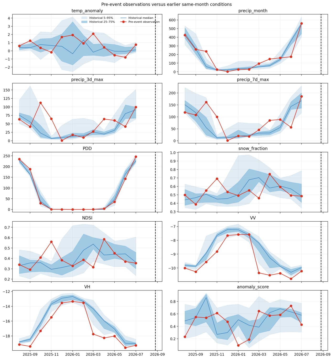
So the analysis compares conditions immediately before August 26, 2026 with the same calendar periods from 1984–2025.
It examined windows of:
1, 3, 7, 14, 30, 60 and 90 days.
This avoids an easy analytical mistake: comparing late-summer conditions with completely different seasons.
Step 2: Something Really Was Unusual
This is one of the clearest results in the paper.
For the 1-day, 3-day and 7-day periods before the event, both temperature and PDD reached the:
100th empirical percentile
among the 42 historical comparison years used by the study.
In plain English:
None of those corresponding historical windows in the study’s 1984–2025 baseline had a higher value.
The thermal signal also remained unusually high across several longer windows.
| Period before event | Temperature percentile | PDD percentile |
|---|---|---|
| 1 day | 100% | 100% |
| 3 days | 100% | 100% |
| 7 days | 100% | 100% |
| 14 days | 97.6% | 97.6% |
| 30 days | 92.9% | 92.9% |
| 60 days | 97.6% | 97.6% |
| 90 days | 71.4% | 71.4% |
Precipitation did not show a similarly extreme pattern, while snowfall was unusually low across most of these windows.
That distinction matters.
The evidence points strongly toward unusual thermal and melt-favourable environmental conditions.
It does not demonstrate that temperature caused the collapse.
We’ll return to that difference.
Step 3: Look Beyond the Event
A single hot week could be unusual without representing a longer-term change.
So the research also examines long-term trends.
One particularly interesting variable was PDD.
The statistical analysis supported an increasing long-term PDD tendency.
Sentinel-1 VV and VH radar backscatter indicators also showed statistically supported negative trends.
However, some results became weaker when the analysis accounted for the fact that environmental measurements over time are related to previous measurements.
For example, the long-term temperature and optical trends were not supported at the same level after the study’s autocorrelation-aware testing.
This is a useful lesson for students:
A graph that looks like it has a trend doesn’t automatically prove that the trend is statistically reliable.
Step 4: Ask AI to Find Unusual Environmental States
Now we reach the machine-learning part.
The researchers deliberately used unsupervised learning.
That means the algorithms were not given thousands of examples labelled:
NORMAL
NORMAL
COLLAPSE
NORMAL
COLLAPSE
There simply isn’t a huge clean dataset of identical glacier-collapse events available for conventional supervised training.
Instead, the AI learns what the historical environmental data normally looks like.
Then it asks:
How unusual is this new observation compared with what I’ve seen before?
That’s anomaly detection.
Understanding Anomaly Detection
Imagine watching students enter a university library.
Most arrive carrying backpacks and laptops.
One day someone enters wearing ski equipment.
That person is unusual.
An anomaly detector might immediately flag them.
But does that mean something dangerous will happen?
Of course not.
The algorithm has discovered:
“This looks different.”
It has not discovered:
“This will cause an event.”
That distinction is essential when applying AI to natural hazards.
The Project Didn’t Trust One AI Model
Different anomaly-detection algorithms notice different kinds of unusual behaviour.
So the project combined three approaches.
Robust standardized distance
This asks roughly:
How far is today’s environmental state from historically typical conditions?
The data are scaled robustly so that extreme observations do not distort the definition of “normal” too easily.
Isolation Forest
Imagine repeatedly dividing observations into smaller groups.
Ordinary observations tend to remain surrounded by similar observations.
Strange observations become isolated quickly.
That’s the intuition behind Isolation Forest.
PCA reconstruction error
PCA learns major patterns in the historical data.
Then it tries to represent new observations using those patterns.
If an observation doesn’t fit well, its reconstruction error becomes larger.
Think of it like learning the common shapes of puzzle pieces.
A piece that doesn’t resemble the learned patterns is harder to reconstruct.
Three AI Opinions Become One Score
The three models produce different kinds of scores.
So the pipeline converts each score into its historical percentile and averages them.
Conceptually:
Environmental Data
        ↓
 ┌──────┼─────────┐
 ↓      ↓         ↓
Distance Isolation PCA
        Forest
 ↓      ↓         ↓
Historical Percentiles
        ↓
      Average
        ↓
 Environmental
 Anomaly Score
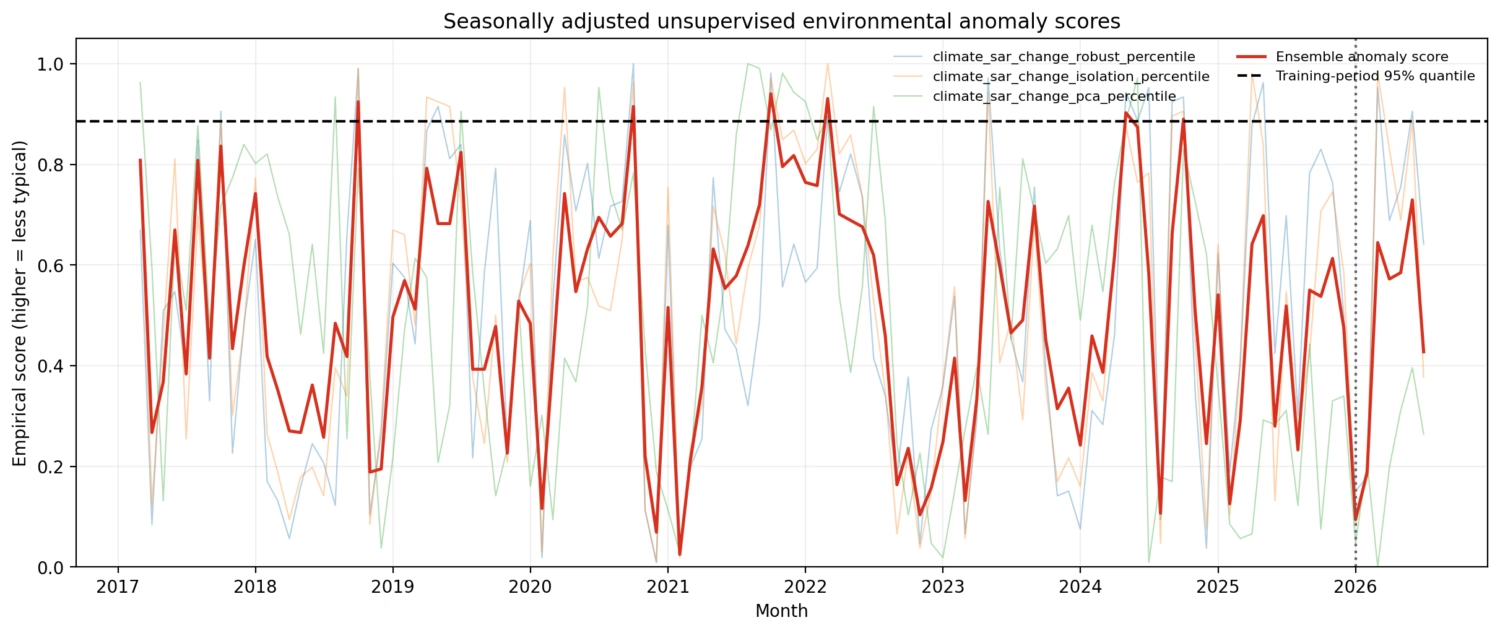
The reference anomaly threshold was based on the 95th percentile of the training ensemble.
But there’s one phrase worth remembering:
This is a rarity score, not P(collapse).
The model tells us how unusual the environmental state appears under its chosen representation.
It does not calculate the probability that a glacier will collapse.
And Then Something Unexpected Happened
Given the extreme short-term temperature results, you might expect the AI model to flash red immediately before the event.
It didn’t.
No scored 2026 month crossed the model’s 95th-percentile threshold.
The highest 2026 ensemble score was approximately 0.730 in June.
And August—the actual event month—was deliberately not scored, because the month was incomplete and therefore failed the pipeline’s completeness requirements.
For an AI project, this negative result is arguably one of its most educational findings.
How Can Extreme Heat Exist Without an Extreme AI Score?
Because the two analyses are asking different questions.
The historical comparison asks:
Was the week immediately before August 26 unusually warm compared with the same week in previous years?
Answer:
Yes—extremely unusual in this dataset.
The AI asks something closer to:
Does the complete monthly combination of climate and radar features look exceptionally unusual compared with historical monthly environmental states?
Answer:
Not according to this model’s threshold for the scored 2026 months.
Those results don’t contradict each other.
Imagine a student who normally scores around 70%.
They suddenly score 100% on one quiz.
That’s highly unusual for that particular quiz.
But if you average their assignments, exams, attendance, projects, and participation across an entire month, their overall profile might not look extraordinary.
Aggregation can hide short-lived extremes.
The research explicitly identifies monthly aggregation, feature selection, missingness, and the combination of multiple signals as factors that determine what the anomaly detector considers “rare.”
Step 5: Satellite Data Has to Pass a Quality Test
Here’s another important lesson.
Having an image does not necessarily mean you have useful evidence.
The Sentinel-2 optical observations demonstrate this beautifully.
Before the event, the optical composite had:
84.1% valid glacier coverage.
After the event:
2.3%.
That is nowhere near enough for a reliable quantitative before-versus-after comparison under the project’s quality rules.
So what did the researchers do?
They rejected the quantitative optical change estimate.
That might sound disappointing.
It’s actually good scientific practice.
Sometimes “I Don’t Know” Is the Correct AI Output
Imagine your computer-vision system receives a photograph where 98% of the object is hidden.
You could still force the model to produce a prediction.
But should you trust it?
Probably not.
A trustworthy system needs another possible output:
GOOD DATA → analyze

QUESTIONABLE DATA → caution

INSUFFICIENT DATA → don't make the claim
The research pipeline explicitly maintains GOOD, CAUTION and INSUFFICIENT quality states.
This prevents poor-quality observations from quietly becoming scientific conclusions.
For students building AI systems, this is a lesson worth remembering:
A model should know when the evidence isn’t good enough.
What Did Radar See?
Sentinel-1 provided a much stronger event-window dataset.
The selected ascending orbit had 289 scenes and 116 usable months, with median valid glacier coverage of 95.6%.
The before-and-after observations on 16 August and 28 August 2026 also retained 95.6% valid coverage.
The whole-glacier average radar changes were small:
ΔVV = −0.0245 dB
ΔVH = +0.1495 dB
But the paper deliberately does not turn those numbers into a claim that radar identified the collapse footprint.
Why?
Because averaging across an entire glacier can hide highly localized changes, and the study did not have a validated source-zone geometry for making that spatial claim.
Again:
measurement ≠ interpretation.
So Did AI Predict the Glacier Collapse?
No.
And the research paper is explicit about this.
The defensible conclusion is that the event was preceded by unusually warm and melt-favourable environmental conditions consistent with environmental conditioning.
The analysis does not establish:
- a physical trigger,
- a causal mechanism,
- a predictive precursor,
- or an operational early-warning capability.
This distinction between conditioning and triggering is perhaps the most important scientific idea in the entire project.
Understanding Conditioning vs Triggering
Imagine a forest during an exceptionally hot, dry summer.
Those conditions may make the forest much more susceptible to fire.
That’s conditioning.
But they don’t tell you what actually ignited a particular fire at 3:17 PM.
That’s the trigger.
Glaciers are obviously different physical systems, but the analogy helps.
The study observed environmental conditions that could be relevant to the broader glacier state.
It did not directly observe several quantities needed to explain the exact mechanical failure, including fracture evolution, stress state, basal conditions, ice thickness, permafrost conditions, and subsurface hydrology.
So saying:
“The glacier experienced exceptionally warm conditions before the event”
is supported.
Saying:
“The heat caused the glacier to collapse”
would go beyond what these data establish.
What This Project Really Teaches About AI
At first glance, this looks like a glacier-monitoring project.
But the lessons apply far beyond glaciers.
A beginner might imagine an AI pipeline like this:
Lots of Data
     ↓
Powerful Model
     ↓
Prediction
Real scientific AI often looks more like:
Messy Observations
        ↓
Are they trustworthy?
        ↓
Are they comparable?
        ↓
What exactly do they measure?
        ↓
What patterns are statistically unusual?
        ↓
What does AI detect?
        ↓
What claims does the evidence
actually allow us to make?
That last question is crucial.
Better AI isn’t simply AI that produces more predictions.
Sometimes better AI means refusing to turn weak evidence into confident conclusions.
Try It Yourself
If you’re a student, this project provides several excellent directions for experimentation.
Beginner: Plot temperature and PDD through time. Compare August conditions across different years, then experiment with different historical windows and see how the definition of “unusual” changes.
Intermediate: Build a simple Isolation Forest anomaly detector using climate variables. Then compare daily, weekly, and monthly aggregation. Watch what happens to short-lived extremes as the time window becomes larger.
Advanced: Reproduce the multisensor anomaly ensemble. Experiment with different features and temporal resolutions, then investigate how the anomaly rankings change. Finally, test the method across multiple glacier events and non-events rather than optimizing it around a single known event.
That final experiment is particularly important.
A system that highlights one historical disaster after we already know when it happened is very different from a system that reliably identifies future hazards.
Where Else Could This Architecture Be Used?
The architecture is broader than glacier science.
The same basic idea—
multiple sensors → quality control → features → historical comparison → anomaly detection → cautious interpretation
—can support environmental monitoring problems involving landslides, drought, floods, wildfire conditions, coastal change, infrastructure monitoring, agriculture, and ecosystem disturbance.
The exact sensors, variables, models, and physical interpretation would change.
The underlying lesson does not:
AI becomes much more useful when it sits inside a well-designed evidence pipeline.
Limitations
This study is a single-event retrospective analysis.
That means it cannot estimate how accurately the system would detect future collapses, how often it would generate false alarms, or whether its patterns generalize to other glaciers.
ERA5-Land is gridded reanalysis rather than a weather station located directly at the failure site.
Sentinel-2’s snow proxy has limitations on debris-covered glacier surfaces.
Sentinel-1 GRD backscatter does not directly measure deformation.
The source and runout zones were not independently validated in the analysis.
And because the anomaly model operates monthly, incomplete August 2026 was intentionally excluded.
These aren’t footnotes to hide.
They’re part of understanding what the AI system actually knows.
Key Takeaways
The Langtang Lirung study gives beginners five especially useful lessons.
First, combine different kinds of evidence. Climate records, radar, optical imagery, and glacier geometry each reveal different pieces of the problem.
Second, compare observations with the right historical baseline. “Hot” means little without knowing what is normal for that location and season.
Third, anomaly detection does not equal prediction. An AI model can identify rarity without knowing whether an event will occur.
Fourth, time scale matters. An extraordinary seven-day signal can become much less obvious inside a monthly representation.
Finally, data quality can be more important than model complexity. Rejecting the 2.3%-coverage optical comparison and leaving incomplete August unscored made the analysis more trustworthy, not less successful.
The Next Project: From Retrospective AI to Glacier Monitoring
The obvious next challenge is much harder.
Instead of asking:
“What did the data look like before a collapse we already know happened?”
ask:
“Can we build a monitoring system that works before we know the outcome?”
That would require higher-frequency anomaly analysis, spatial radar change detection, glacier velocity and deformation information, better physical observations, and—most importantly—testing across many events and many non-events.
Only then could researchers begin evaluating quantities such as false-positive rates, sensitivity, specificity, and operational thresholds.
The paper itself proposes this broader direction: a quality-aware monitoring architecture connecting climate forcing → cryospheric state → terrain/slope state → physical deformation or change → event and runout.
And that is where AI for Earth observation becomes especially interesting.
Not as a machine that magically predicts disasters.
But as one layer in a system that helps humans make sense of an increasingly observable planet.
Discover more from Debabrata Pruseth
Subscribe to get the latest posts sent to your email.