

- A Beginner-Friendly Guide to Explainable AI (XAI)
- 1. Why Do We Need Explainable AI?
- 2. What Does Explainability in AI Mean?
- 3. Example Problem: Predicting Income from Demographics
- 4. SHAP: Game Theory for Model Explanations
- 5. LIME: Model-Agnostic Local Explanations
- 6. ELI5 — Simple, Human-Friendly Explanations
- 7. DALEX — Auditing and Diagnostics
- 8. PDP & ICE — Understanding Feature Effects and Fairness
- 9. Summary
Understanding why an AI model makes a specific decision is just as important as the decision itself. This guide gives you a clear, student‑friendly introduction to Explainable AI (XAI), covering SHAP, LIME, ELI5, DALEX, PDP, ICE, and more—using a real dataset to make everything concrete.
1. Why Do We Need Explainable AI?
Before diving into specific techniques, it’s helpful to understand how explainability connects the ethical goals of AI—like fairness and accountability—with the technical methods that make model behavior transparent.
AI systems influence almost every part of daily life—what videos we see, how loans are approved, which job applicants are shortlisted, and even how doctors support medical decisions. Because these systems have such a huge impact, we must understand why they make certain predictions.
This is where Explainable AI (XAI) becomes essential. XAI helps us uncover the reasoning behind a model’s predictions so systems can be:
- Transparent — not mysterious or hidden.
- Accountable — easy to audit or question.
- Fair — checked for bias against any group.
- Trustworthy — reliable and safe for real-world use.
Explainability is a key part of Responsible AI, ensuring AI systems are accurate and ethical.
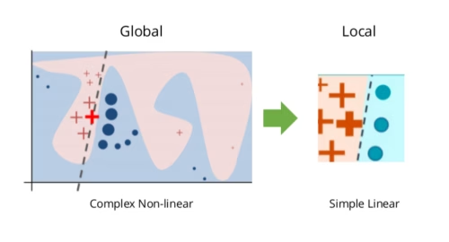
2. What Does Explainability in AI Mean?
There are two major types of explainability:
Global Explainability — How the Model Behaves Overall
- Which features are most important?
- Are the model’s patterns meaningful or strange?
- Does the model treat different groups consistently?
Local Explainability — Why ‘One’ Specific Prediction Happened
- What pushed this prediction higher or lower?
- How much did each feature contribute?
Global explanations help developers improve the model. Local explanations help users understand individual decisions, such as why a loan application was approved or denied.
3. Example Problem: Predicting Income from Demographics
To make XAI easier to understand, we use the classic — and very educational — UCI Adult Income dataset. It’s widely used in teaching because it includes a mix of numerical and categorical features, a clear binary target, and enough diversity to reveal meaningful model behaviors. UCI Adult Income dataset, which predicts whether a person earns more than $50K per year based on following features:
- Education level
- Relationship status
- Hours worked per week
- Capital gains/losses
- Occupation and workclass
The dataset is simple but ideal for demonstrating different explainability tools. Full code and visuals are available on my GitHub; here, we focus on interpreting the results.
4. SHAP: Game Theory for Model Explanations
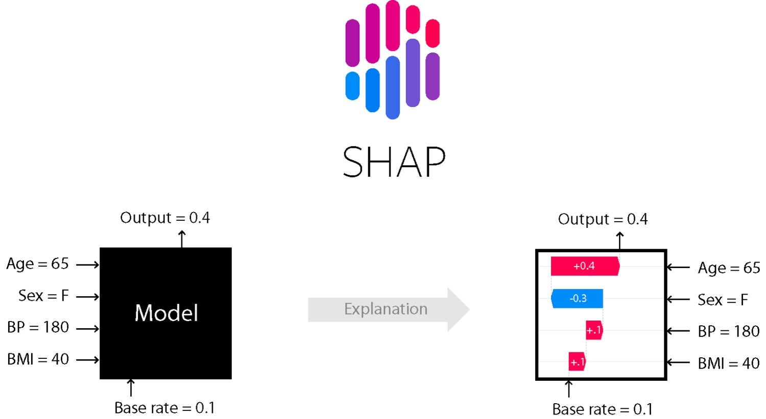
SHAP (SHapley Additive exPlanations) is one of the most powerful explainability methods. It’s based on Shapley values from game theory, which fairly divide credit among players in a game. In SHAP, each feature acts like a player contributing to a prediction.
How SHAP Works
- Every feature contributes positively or negatively.
- SHAP calculates the exact contribution of each feature.
- It offers both global and local explanations.
It’s mathematically sound and works for almost any machine learning model.
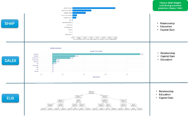
A. Global Explanation — SHAP Bar Plot
This section connects back to the idea of global explainability introduced earlier, showing how SHAP helps us understand the model’s overall behavior.
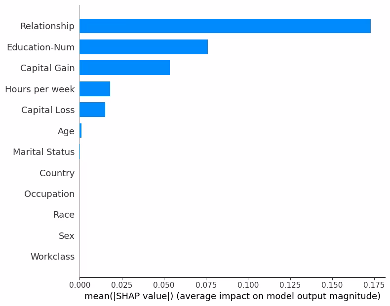
This plot shows the average impact of each feature e.g Relationship, Education etc. for the model we created ( Refer the code run in GitHub link) to predict adult income.
Interpretation:
- Longer bars imply more important features e.g. Relationships
- Positive values → push predictions toward “> 50K”.
- Negative values → push predictions toward “< 50K”.
In our model, Education, Relationship, and Capital Gain often have the strongest influence.
Use this plot when you want a simple, complete overview of model behavior.
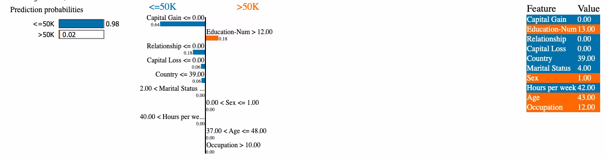
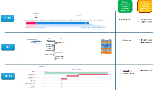
B. Local Explanation — SHAP Force Plot
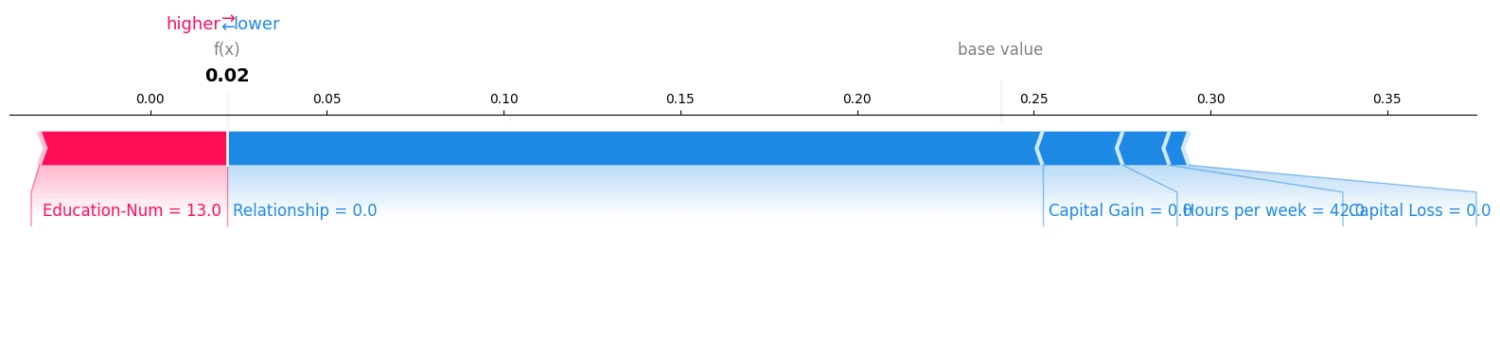
SHAP bar plot explains global explainability of model. But what if we want to deep dive into one specific prediction and understand why? The SHAP force plot breaks down a single prediction, almost like following the model’s reasoning.
Red features in force plot push the prediction up; blue features push it down. The plot shows:
- Base Value (Expected Value): the model’s average prediction for the training data (shown at the center).
- Feature Contributions — how each feature changed the prediction.
- Final Output — the model’s decision for that person.
The above force plot is for one adult ( Adult #10 from the UCI database).
As we can see , Red bars (positive SHAP values), features like Education increase the probability of earning > 50K for the adult. On the other hand Blue bars ( negative SHAP values), features like relationship decrease the probability of earning >50K for the given adult.
By comparing force plots for different individuals, you can see how the model treats people with different characteristics (features).
C. SHAP Beeswarm Plot — Global + Local Combined
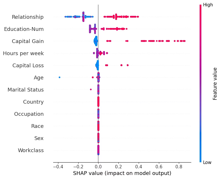
This is one of SHAP’s richest visualizations.
What it shows:
- Each dot in the plot represents one person ( In our case one adult each from the UCI database)
- X-axis (position): SHAP value → impact on the prediction (positive = more likely > 50K, negative = less likely).
- Y-axis (feature): Features sorted by average importance (from most to least influential).
- Color gradient: Feature value (blue : low ; red : high) reveals correlation between value and impact.
How to read it:
- Feature Ranking: Features higher up are more influential globally. e.g., Education and Relationship dominate in our example.
- Direction of Effect:
- If red dots are mostly on the right → higher feature values increase the chance of > 50K.
- If red dots are mostly on the left → higher feature values reduce that chance.
- Variability Insight: The spread (width) shows how inconsistent that feature’s effect is across samples. Wide spread imply the given feature interacts heavily with others.
High education consistently pushes predictions toward “>50K,” confirming its strong positive effect in this example.
Note,
- The bar plot summarizes importance.
- The beeswarm plot reveals variability, direction, and interactions.
They work best when viewed together.
5. LIME: Model-Agnostic Local Explanations
Now we have understood SWAP global and local explainability capabilities. However for specifically understanding local explainability in models we have one more power framework called LIME.
LIME ( Local Interpretable Model-agnostic Explanations) is a tool that helps us understand why an AI made a single decision. LIME explains one prediction at a time by approximating the model locally with a simple, interpretable model.
How LIME Works
- It picks one result (like your loan being approved or rejected).
- It changes your details a little, one by one (for example, changing your age or job slightly).
- It watches how the AI’s answer changes.
- It then builds a simple explanation that shows which details mattered most for that decision.
It takes one decision (in our example, if a given person income is more or less than 50K). It makes small changes to person’s information, one at a time, to see how the AI’s decision changes. By seeing which changes affect the decision the most, LIME figures out which factors (like Relationship, Education etc.) mattered most for predicting the salary outcome for that person.
How to Interpret LIME
- Positive weights : push toward positive prediction
- Negative weights : push toward negative prediction
- Higher weights : stronger influence.
Example LIME interpretation ( For Adult # 10)
“Education-Num ” with weight +0.18 : increases probability of income > 50K.
“Relationship” with weight –0.18 : decreases it.
LIME is fast, flexible, and works with any black‑box model.
SHAP vs. LIME — Explaining the Same Prediction
SHAP vs LIME prediction ( side by side comparison) for Adult #10 :
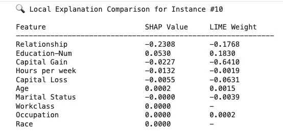
Interpretation:
- Both methods agree on direction. ‘Education’ contributes positively towards predicting income >50K where as features like ‘Relationship’ contribute negatively.
- SHAP is more exact. LIME gives a reasonable approximation.
- Note, when magnitudes differ between SHAP and LIME, it indicates that LIME’s local approximation may not fully capture SHAP’s nonlinear behavior.
Using both SHAP and LIME gives a more complete understanding of a given prediction from the model.
6. ELI5 — Simple, Human-Friendly Explanations
ELI5 = “Explain Like I’m 5” — focuses on quick, readable visual explanations.
ELI5 works especially well with models like logistic regression, linear regression, and decision trees because their structure makes feature contributions easy to interpret. For example, in a simple linear model predicting income, ELI5 can show that each additional year of education adds a specific amount to the prediction, making the reasoning very clear.
ELI5 creates easy-to-read explanations, especially for linear models and decision trees.
What ELI5 Provides
- Global feature importance ( Model level )
- Local prediction breakdowns ( Explinability for a single prediction from the model )
- Clear text-based summaries
How to Read ELI5
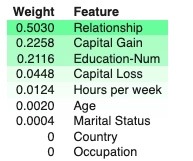
- Positive weight : increases the prediction e.g. Relationship with value 0.5030 in our example
- Negative weight : decreases the prediction e.g. Occupation
ELI5 is great for beginners or when you need quick, simple insights.
ELI5 feature ranking and weights can differ from SHAP rankings because both follow different approach. Use ELI5’s global ranking as a starting summary, then show SHAP to explain why and how these features matter. ELI5 tells what is important globally; SHAP tells how and in which direction.
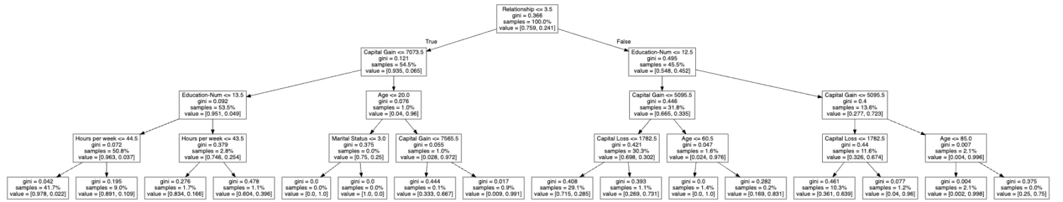
ELI5 also provides another rich feature showing how a model decision tree works as shown below from the sample code run.
7. DALEX — Auditing and Diagnostics
DALEX (Descriptive mAchine Learning EXplanations)is a deep model-auditing framework that goes beyond basic explanations.
What DALEX Offers
- Checks how well your model is performing. (Shows metrics like accuracy, precision, confusion matrix, etc.)
- Shows which features matter most for the model’s predictions. (Like “Is relationship or education more important in deciding income?”)
- Explains individual predictions. (Breaks down exactly how the model arrived at an answer for one specific person.)
- Helps you compare different models side by side. (Useful if you want to choose the best or most fair model.)
DALEX global feature importance
DALEX can tell you, on average, which features (like age, education, or capital gain) are most influential in your model’s decisions.
- It does this by mixing up each feature (one at a time) and seeing how much that hurts the model’s accuracy.
- The bigger the drop in accuracy, the more important that feature is.
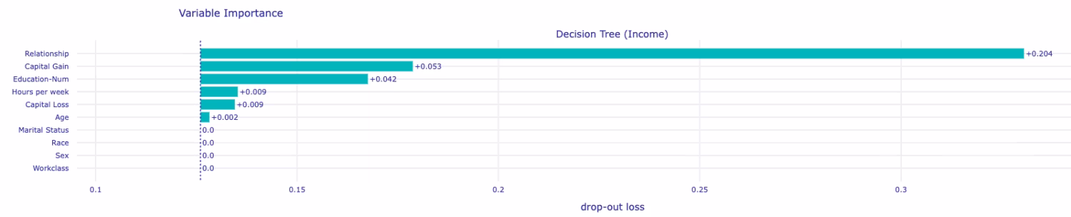
- Interpretation:
- Bars show importance magnitude.
- Top-ranked features (e.g., Education-Num, Relationship, Capital-Gain) are the model’s main decision drivers in our example.
- DALEX complements SHAP’s global summary but is model-agnostic and directly tied to performance metrics.
DALEX Local Explanations (Break Down Plot)
DALEX can also explain one specific prediction from the model, step by step. It starts from the average prediction for everyone, and then adds or subtracts points for each feature to reach the final answer for that prediction for that individual.
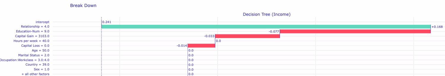
- Goal: Explain one specific prediction — “why did the model predict what it did?”. The above run is for Adult 10 which we also referenced in SHAP and LIME
- Positive contributions (bars going right) : increase predicted probability
- Negative contributions (bars going left) : decrease predicted probability
- The longer the bar, the stronger the influence on model predictions overall. For this individual ( Adult #10) , lower education decreased income prediction, while relationship increased it
How to Use DALEX Effectively
- Always check performance metrics first.
- Use global feature check to see which features truly matter.
- Use local breakdown plots to understand the steps behind individual predictions.
DALEX is especially useful for high-stakes or sensitive applications. As a best practice, always compare DALEX’s global importance with SHAP’s global summary plot to see consistency.
8. PDP & ICE — Understanding Feature Effects and Fairness
Shows how changing a feature affects the model’s average prediction. It shows the average model prediction as a feature changes, holding all other features constant. Useful for confirming or questioning what SHAP, LIME, or DALEX indicated.
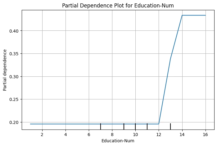
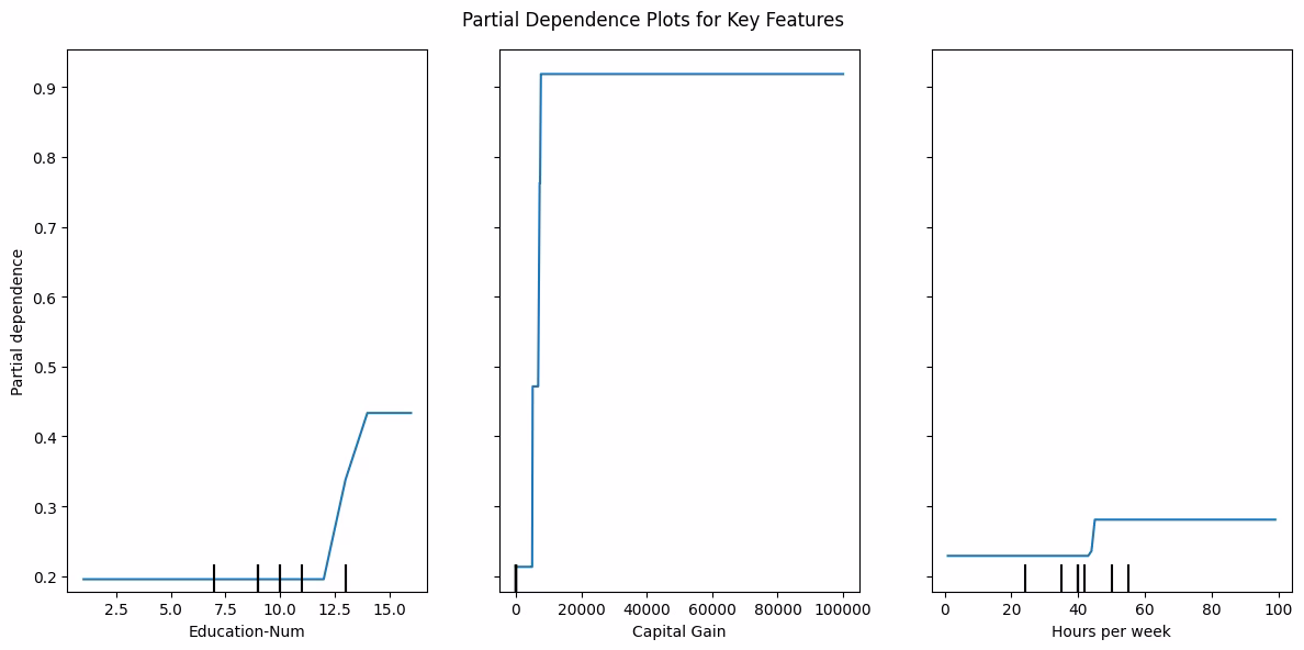
In the above example, PDP curve rises with education level, it means higher education usually increases predicted income. A steep rise in Capital Gain on the other hand implies model associates high capital gains with high income probability. For Hours per week, the curve rise up to ~40 hours and plateau, showing diminishing returns. Note, a flat curve means that feature changes don’t strongly affect predictions.
ICE (Individual Conditional Expectation)
PDP and ICE together shows how each person’s prediction in a model changes ( individually)
PDP and ICE work together:
- PDP (Partial Dependence Plot) : average effect of a feature on predictions. remember, PDP is mean of all ICE lines.
- ICE (Individual Conditional Expectation) : individual variation in that effect across data points. Note, ICE plots are crucial to identify if the model treats different individuals consistently or unevenly based on feature values.
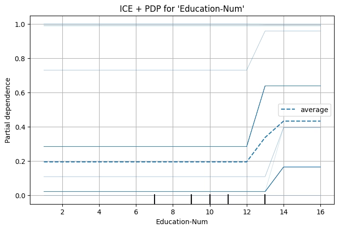
PDP + ICE interpretation of Single Feature (Education)
- Gray lines (ICE): show how predicted income probability changes per individual as education increases.
- Blue line (PDP): the average of those gray lines , the overall trend.
- If all gray lines roughly follow the same direction as the blue lines, model treats everyone similarly (stable pattern).
- If gray lines diverge or cross, model interactions exist; effect of ‘education’ differs across individuals.
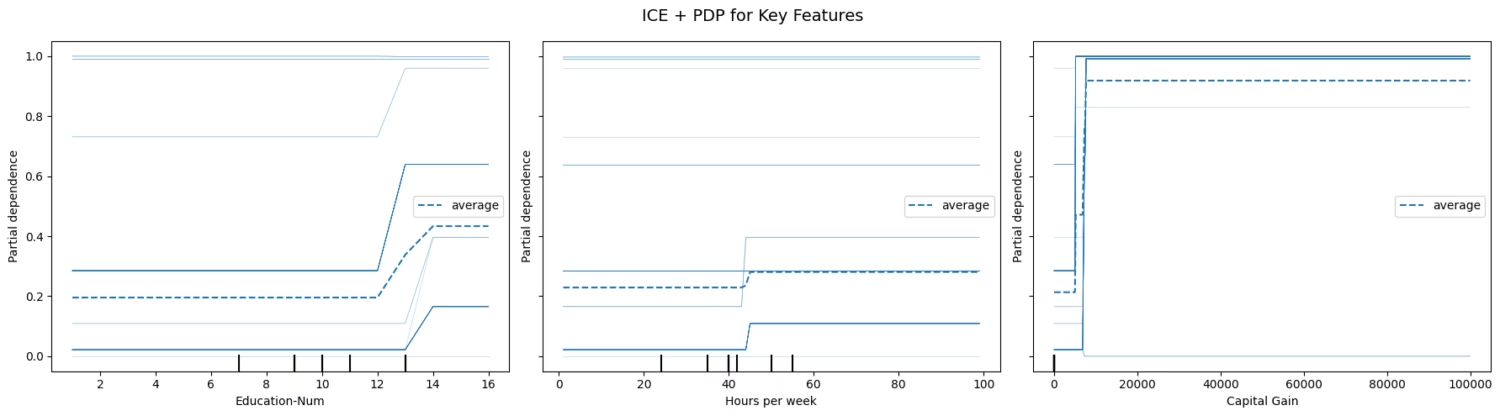
Fairness example:
ICE is also a powerful tool to help surface potential bias by showing how the model’s predictions vary for individuals within a group. Here, we compare ICE curves for males and females on the feature ‘Education’. This comparison reveals whether the model treats men and women similarly when education levels change.
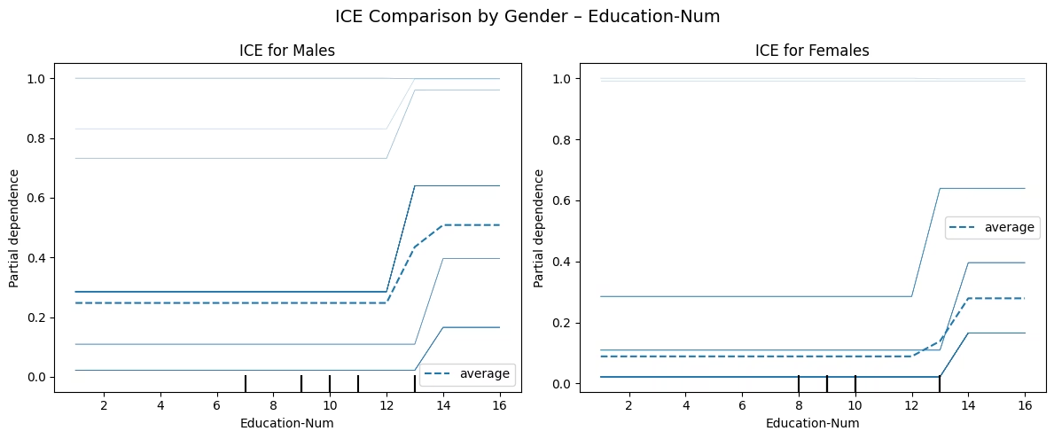
- Gray lines (individuals) show how each male/female predicted probability of >50K changes with education.
- Blue dotted line (average PDP) shows the average male/female trend.
- Typically, you’d expect a monotonic upward slope, more education imply higher income prediction for both male and females
- In this example we can see the blue PDP line for women is lower or flatter, it means the model predicts lower income probabilities for women with similar education compared to male.
9. Summary
Global Explainability (Model level)
As a best practice always run multiple explainability frameworks against your model and compare.
Local Explainability ( Adult # 10)
When to use which tool
| Tool | What It Explains | Best Use Case |
| SHAP | Global + Local contributions | Deep, theory-backed understanding |
| LIME | Local surrogate | Quick, model-agnostic local explanations |
| ELI5 | Linear/tree transparency | Simple, readable summaries |
| DALEX | Auditing + diagnostics | High-stakes or fairness-critical models |
| PDP | Average feature effects | Global sanity checks |
| ICE | Individual effects | Bias and fairness detection |
Explainability isn’t just a nice-to-have—it’s essential for building AI systems that people can trust. Tools like SHAP, DALEX and LIME explain themselves—and let your users understand them.
Want to learn more about everyday use of AI?
Discover more from Debabrata Pruseth
Subscribe to get the latest posts sent to your email.